As someone who enjoys playing Dungeons and Dragons, I also get fascinated by the primitive random number generators used it them, the dice. When I talk dice with friends and internet strangers, the conversation sometimes leans towards discussing whether or not their dice are fair.
Now if you search for how to test this, you can find a few good answers to explain the various statistical tests that can be used, along with their pros and their cons, so I’m not going to do that here.
While probabilities of several dice together can get messy really quickly without having to pull out a reference for my courses in Probability, one quick and dirty way we have of checking the odds of results is using simulations, and doing large simulations of die rolls is pretty quick on modern machines.
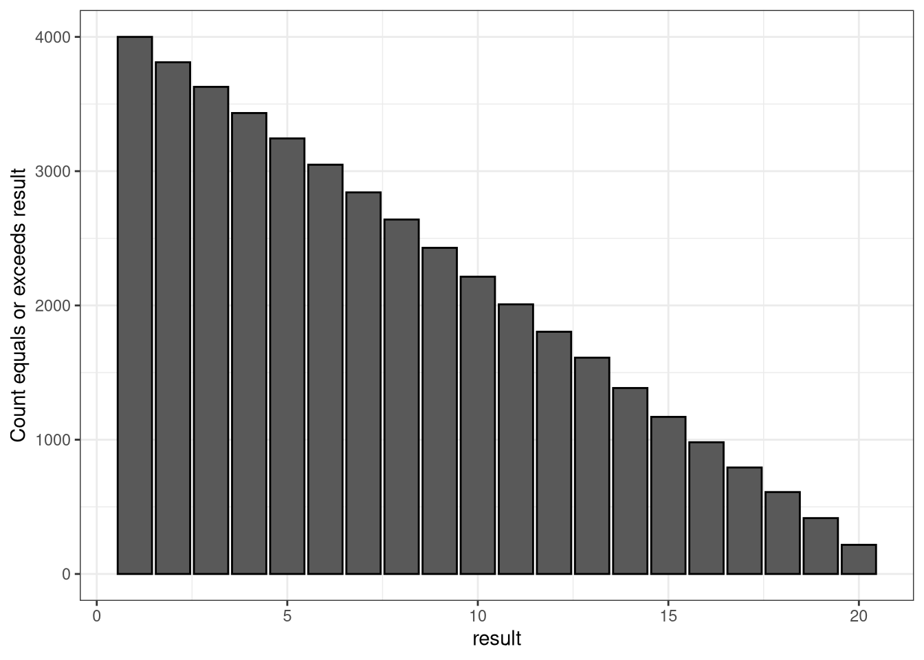
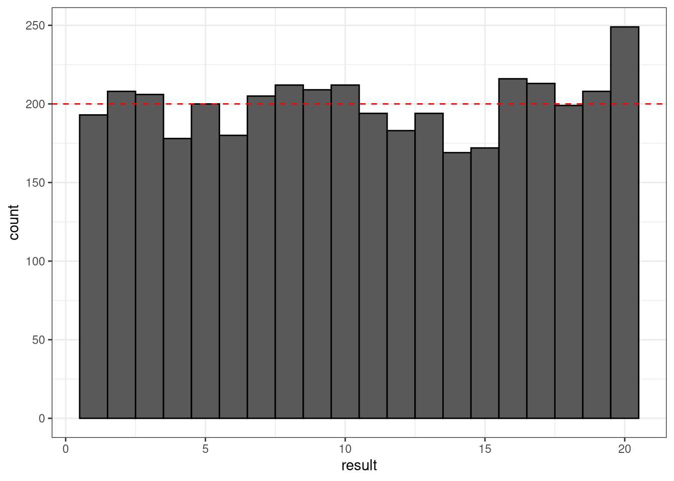
So, for this first simulation I wanted to take a d20, a 20-sided die and simulate the results of a chi-squared test with a decent sample size, enough to expect each result 200 times, plot a histogram of the results, and plot a cumulative bar chart showing the odds of getting at least a certain result. Then we can attempt to quantify the fairness by doing a chi-squared test.
library(tidyverse)## ── Attaching packages ─────────────────────────────────────── tidyverse 1.3.1 ──## ✓ ggplot2 3.3.3 ✓ purrr 0.3.4
## ✓ tibble 3.1.2 ✓ dplyr 1.0.6
## ✓ tidyr 1.1.3 ✓ stringr 1.4.0
## ✓ readr 1.4.0 ✓ forcats 0.5.1## ── Conflicts ────────────────────────────────────────── tidyverse_conflicts() ──
## x dplyr::filter() masks stats::filter()
## x dplyr::lag() masks stats::lag()theme_set(theme_bw())
set.seed(1)
n <- 4000
d <- 20
dfair <- tibble(result = sample(x = seq.int(from = 1, to = d), size = n, replace = TRUE))
dcountsfair <- dfair %>% group_by(result) %>% count()
dcountsfair$cum <- rev(cumsum(rev(dcountsfair$n)))
dfair %>%
ggplot(aes(x = result)) +
geom_histogram(binwidth = 1, col = "black") +
geom_hline(yintercept=n/d, linetype="dashed", color = "red")
dcountsfair %>%
            ggplot(aes(x = result)) +
            geom_bar(aes(y = cum), stat = "identity",
                           col = "black") +
            xlab("result") +
            ylab("Count equals or exceeds result")
chisq.test(table(dfair), p = rep(1/d, d))##
## Chi-squared test for given probabilities
##
## data: table(dfair)
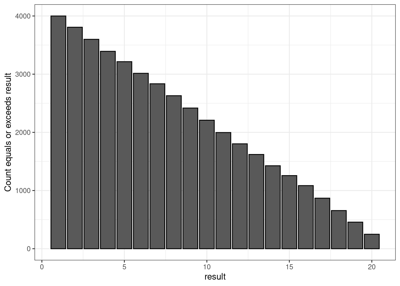
## X-squared = 14.2, df = 19, p-value = 0.7719Now, let’s do the same thing with a simulated die that the highest result is 10% more likely and the lowest result is 10% less likely.
set.seed(1)
dweighted <- tibble(result = sample(x = seq.int(from = 1, to = d), size = n, replace = TRUE, prob = c(0.9, rep(1, d - 2), 1.1)))
dcountsweighted <- dweighted %>% group_by(result) %>% count()
dcountsweighted$cum <- rev(cumsum(rev(dcountsweighted$n)))

dweighted %>%
  ggplot(aes(x = result)) +
  geom_histogram(binwidth = 1, col = "black") +
  geom_hline(yintercept=n/d, linetype="dashed", color = "red")
dcountsweighted %>%
            ggplot(aes(x = result)) +
            geom_bar(aes(y = cum), stat = "identity",
                           col = "black") +
            xlab("result") +
            ylab("Count equals or exceeds result")
chisq.test(table(dweighted), p = rep(1/d, d))##
## Chi-squared test for given probabilities
##
## data: table(dweighted)
## X-squared = 32.12, df = 19, p-value = 0.0303To the casual observer, the histogram and cumulative bar plots don’t really look that different from each other. Sure, the number of 20’s are higher in the weighted simulation, but it was also higher in the fair simulation. But here we see the results of the Chi-squared test reveal things are quite a bit different in these results.
Of course detecting this deviation is a function of how severe the problem is versus the sample size.
Next time I’ll be looking at a different test with the same simulation, the Kolmogorov-Smirnov test.